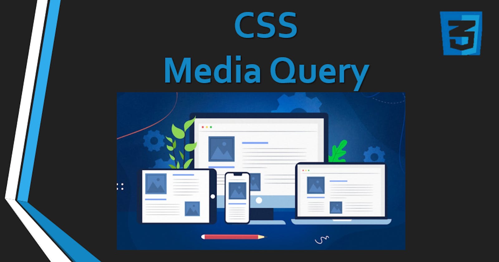


What are media queries?
A media query is a logical operation. Whenever a media query becomes true, then the related CSS is applied to the target element.Media queries are a key part of responsive web design, as they allow you to create different layouts depending on the size of the viewport, but they can also be used to detect other things about the environment your site is running on, for example whether the user is using a touchscreen rather than a mouse
It is a specific feature of CSS that lets you conditionally apply styling based on a media type, a media feature or both. You use them primarily to check the screen dimensions and apply CSS based on that, but media queries can do many other powerful things.
What is the used of Media Queries and its Breakpoints?
Media queries are used when we want to customize our website's presentation according to the user's screen size. With the help of media queries, you can display different markups based upon the device's general type(mobile, desktop, tablet).
Breakpoints:-
The points at which a media query is introduced and where the layout changes are called breakpoints**.**
Breakpoints are pixel values that you can define in CSS. When a responsive site reaches these values, a change in the design will occur.
You should set up your responsive breakpoints based on the unique needs of your design.
Add a breakpoint where content becomes harder to read because of increasing or decreasing screen widths.
some common breakpoints for widths of different devices:
devices : (min-width —— max.width)
Mobile devices: 320px — 480px.
iPads, Tablets: 481px — 768px.
Small screens, laptops: 769px — 1024px.
Desktops, large screens: 1025px — 1200px.
1201px and more — Extra large screens, TV.
Syntax :-
Here's the general structure of a media query:
@media <media-type> and (media feature) {
  ..............
}
Max-width:-
Here is an example of a max-width query
@media only screen and (max-width: 700px) {...}
What this query means, is “If [device width] is less than or equal to 700px, then do {…}”
Min-width:-
Here is an example of a min-width query
@media screen and (min-width: 400px) {
  /*...*/
}
What this query means is "if the site is being shown on a screen and that screen's width is at least 400px wide, apply this CSS".
Combining media query expressions:-
@media (min-width: 400px) and (max-width: 800px) {
  /*...*/
}

(or)

@media (min-width: 400px) {
  @media (max-width: 800px) {
    /*...*/
  }
}
Which tells a browser to apply this CSS if the browser width is between 400 and 800 pixels.